Student Spotlight: Timothy Charles Roseborough '18
For this week’s Student Spotlight, we caught up with Timothy Charles Roseborough ‘18, who is now a 2nd-year student in the MFA Visual Arts Program, to see how his work has progressed since we last talked. (Timothy’s interview as a 1st-year student can be found here). Here’s what we learned:
Tell us about your current projects.
I should take one step back and tell you about Englyph—Englyph is a writing system that I developed. It consists of a specialized font that makes our Latin-based alphabet writing system seem abstract again, even though it's still readable. It's a conflation of “English” and “Hieroglyphics." It's “English Hieroglyphics” or “American Hieroglyphics,” in a way.
I was inspired by a trip to a Korean restaurant one day. I love all kinds of food. They gave me a Korean menu which meant that I couldn't read it at all, but I knew it that it meant food of some sort. It forced me to appreciate not just what it was saying, but really appreciate the way that the script looked, the writing system, and how beautiful it was—all it was, to me, was a book of art because I couldn't read it. And that inspired me to think, “How can I take the language I'm used to, with the writing system I'm used to, how can I make it abstract but still readable so someone could have that same experience?” And so, I made many iterations of that over the years after I created Englyph—Prints and all kinds of different projects around Englyph. The one [project] at Open Studios is my latest one.
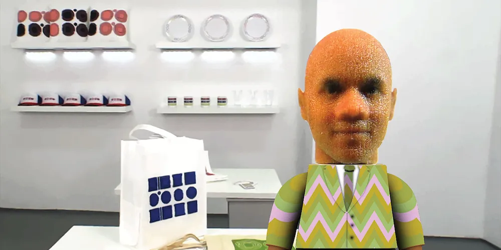
I usually work on a project-by-project basis. When I came into my studio, after I’d painted it, I was just like, “Wow, this seems like a good place to do an installation because it's so pristine-seeming. It would be a great place to have something like a gift shop or a faux-gift shop.” I also love gift stores no matter where I go—In the museum my favorite place is the gift shop. I like the exhibitions but I love more to go and look at the gifts after the exhibition, or the t-shirts, or things like that. One of my favorite gift shops is at the Tate Modern in London.
I also wanted to show off the ways that Englyph could be applied. So the next thing about this that I had to figure out the theme, and in these politically charged times, I thought, “Why don't I use different types of phrases of resistance?” I did some research and decided which phrases I would turn into Englyph and how I would present them. So, for instance, this t-shirt [says] “Decolonized and Displaced.” I was thinking of the phrases you might see at Columbia.
I have others with humor; this tote bag says “Property is Theft.” I have some dog tags which, of course, are associated with the military, and they say "No nukes.” I have plates that say, “Eat the Rich,” which is another phrase that you might hear….I have “The Personal is Political” pillows, and “Free Education” mugs because I thought, a teacher often has a mug. So that's kind of the main theme, political slogans. It's also a commentary on how people use these phrases as a “lifestyle.” So that's really the basis of this, and I'm still working on it.
I'm curious to learn more about how you created your own alphabet.
Essentially, I did a lot of research on different types of writing systems. I was attracted to Hieroglyphs because they just have a really interesting look. The problem with Hieroglyphics of North African, Egyptian, Mayan descent, which are called logographic systems, is that they have a one-to-one ratio between the symbol and the word. I would have had to create thousands and thousands of symbols. How could I make so many different symbols? After working with logographic systems, I thought, “How could I make a cheat that would look like I was making thousands of symbols for the word, “tree,” [for example]—or, instead, just one symbol?” And I came up with the idea of making a font that would read from around the edges instead of written left to right, and that they [the letters] would nest inside of each other.