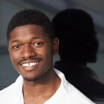
Kevin Cobb Encounters Hans Holbein
Kevin Cobb creates remarkable works on canvas, paper, panel, and the screen. An artist of many trades, to which he brings a tremendous amount of generosity of care and spirit, Kevin is also one of the Visual Arts Program’s student representatives.

Encounters is a series where we talk to Columbia Visual, Sound, and Performance artists about the art that compels them to see and create in new ways.
Kevin Cobb creates remarkable works on canvas, paper, panel, and the screen. An artist of many trades, to which he brings a tremendous amount of generosity of care and spirit, Kevin is also one of the Visual Arts Program’s student representatives. We met in his studio for a conversation about his first encounter with a work of art that shaped his practice and values as an artist.
In this conversation we reference two paintings—The Ambassadors (1533) and Portrait of Sir Thomas More (1527)—both rendered by the 16th century painter Hans Holbein the Younger. Surrounding our discussion is the echo of two essays by the art critic John Berger about The Ambassadors, which may be found in chapter five of Berger’s Ways of Seeing (1972/2008), and “Studio Talk (for Miquel Barceló),” which may be found in The Shape of a Pocket (2001).
So, tell me about The Ambassadors. Why did you choose it as one of your encounters?
Kevin Cobb: I love how it was painted. I initially found out about it because I went to an art high school and in my intro to painting and drawing classes we had access to a lot of drawing books and I found a book on Hans Holbein the Younger. I saw a full page spread of The Ambassadors and I noticed the detail of the background wallpaper, and I was aware of Kehinde Wiley at the time, and I could see Kehinde Wiley being really influenced by the lusciousness of this background. I noticed the table, the way that Holbein painted it. I’d painted cloth before, but when you’re painting cloth and you’re also painting this sort of mattie, woven material, it’s difficult. The way Holbein painted it was actually in pixels, because it’s a gridded thing—I could imagine a contemporary painter doing a very brushy, smushy way of painting that texture.
But the texture of the tablecloth in The Ambassadors is painted through pixels, like Pointilism in a way, like hyper-pointilism?
KC: Yes, sort of like pixelism.
Is pixelism a term in painting?
KC: No, I don’t think that’s an official term.
Ok, well, we’ll invent a term here: Pixelism.
KC: So, they had that pixelism and the floor tiles—they’re stone—they’re all painted in a way that’s harmonious with their material as well. The way it’s painted has so much skill and aptitude; not just the likeness of the people, but the attention to detail, like the numbers, the textures, that shine, and the gold—it just seems that Holbein put so much into it. Similarly, in that other portrait by Holbein, Portrait of Sir Thomas More, there are such luscious velvet arms and a lovely gold chain. There is such a remarkable amount of detail in the velvet. It almost stands outside of the picture plane. It almost feels like a digital kind of collage.
If it’s the attention to detail that grabbed you, what, then, kept you returning to these works?
KC: Even just seeing how Holbein did the fur—I was blown away by the technique involved. It impressed me on a visceral level and that led me to believe that I should look further, and that gave me a doorway into exploring things conceptually. I think there’s something about skill or craft, which indicates that other types of facility or skill or insight are present.
There’s so much technique in this painting–it’s remarkable.
KC: Yeah! It’s a mind blowing painting. And when Holbein gets to the marble…everything just seems just right for what he was intending. And that idea is really powerful to me: that through skill and effort and knowledge, you can obtain results that are very much in line with what you were expecting.
It’s interesting to me that since this painting is so overtly about a display of wealth, and wealth is associated with quality, there’s also such a high degree of detail in the painting itself—it really matches the subject. He couldn’t have made this painting in any other way; it had to be this detailed.
KC: It had to, yeah! The paintings evoke a lot of power, and I think that’s just innately impressive, or, at least, they’re designed to grab your attention, and you just feel how much care went into making them—they feel like a real artifact, like a diamond almost, like it could live for so long.
It’s curious you mention care. That is what I am struck by in your work: this great degree of not just attention to detail, but a tenderness, a true care towards even the folds on a pant or in the shirt in He Is! (2021). I think it’s because of how you get light to do that ‘thing.’ One can only do that from a concern and genuine care for the subject in the painting, rather than merely relying on a deft artistic skill set. In “Studio Talk (for Miquel Barceló)” John Berger refers to that quality as ‘the face’ of the painting, which needn’t be a face per se—it can be a section of light on a pant leg, for instance.
KC: Thank you, yeah. A big thing I want from my paintings is something I call ‘replay value,’ where it’s so good that you can view it again and keep exploring. It isn’t all just about the most efficient vehicle of communicating a point, it’s also about creating a space and a hospitable environment to feast your eyes on.
Yes, there is so much to ‘feast your eyes on’ in the Holbein painting, both visually, but also symbolically. He could have demonstrated wealth in a number of ways, if that was the only message, if it was didactic in that way.
KC: Yeah, he could have just painted their storage vault or something.
Yes!
KC: I definitely think [the painting is about] more than just wealth and power. That’s definitely part of it, but there’s also friendship and religious themes, there’s hope and optimism, and humanism in particular—this is a very humanist painting in the 16th century sense that I think is a good icon for the spirit of the age of that time period. I like the idea of encapsulating a spirit into a painting and trying to have it address all those extraneous details: there’s a central point that everything gravitates around, but then all the details fill in other questions, maybe aesthetic questions, it fills in more facets of that idea so that it feels more alive.
Can we talk about that morphed skull in the middle of The Ambassadors painting? It seems to come out of nowhere. The first time I saw that painting in a book I thought it was a mistake in the printing, because it is so strange and so random and incoherent in relation to the rest.
KC: I am surprised to hear that, because I see it as a sign of the subversion of death through technology and knowledge. So, I see this as a display of all this knowledge and futuristic technology at the time and how that can eventually promise the total eclipsing of this skull and the possibility of death.
That is such a coherent way of explaining what that could possibly mean. It’s brilliant. When you put yourself before a painting, another’s or even your own, is coherence something that you initially notice?
KC: Yeah, definitely. I am always interested in why a painter made their decisions. For instance, in looking at the floor pattern in The Ambassadors, I was thinking that maybe they didn’t really have this floor and Holbein made it up so that he could have these circles that could identify the two figures as equals; and the triangular shape at the bottom gives the composition a kind of downward slope, which leads you from the figures, to the knowledge, to the askew skull. So that is one way I think people in this time period also thought–basically a graphic design sense.
Are you thinking of “a graphic design sense” as in aesthetic coherence?
KC: Yes, design is useful because it’s more accessible, [it makes the paintings more accessible.]
How does that sense of design coherence in Holbein, then, figure in your own work?
KC: I am definitely interested in having my paintings be logically coherent, logically sound in some way. A Cezanne painting, for example. If you’re looking at one of his paintings with the apples, and some of them may be askew, or they may have brush strokes that seem to be the most efficient or most expressive way of painting. My instinct, if I am going to skew an apple, I want the rest of the painting to explain why that is happening in some way. So I might have a specific device in the painting, like a warbly glass surface that everything is being seen through that would justify that in some way.
And why is that important to you?
KC: It’s important because I think of them as plot holes, maybe, where it just seems inexplicable—and I think that takes people out of the spirit of the painting. I want to create a structure where everything in the painting seems to make sense.
So, can we talk about the logic of signs and symbols in your work?
KC: There are two different parts to my practice when I am painting from this through-my-body point of view. There is a part where I want to be very literal: I want to share how I feel or how I see the world from a very pulled back first person point of view and literal way of thinking about it. In that sense, I also want to deprive or remove content or the idea of design from that. I want to express the idea that how I see the world in a given moment is the totality of what I'm aware of. For example, Rainbow Pumpkin, which is a still life of the things that were actually in my living room, is very slightly composed, and the painting serves as a vehicle for me to express this vision or to express reflecting on things. Then, there’s a part of my practice where I'll dip into some signification, like in He Is! It's also just fairly straight faced, looking at myself painting and painting it, but then I also have my phone there which is where I'm listening to an audiobook version of the Bible and I think of that as a very potent sign that I can use to kind of throw certain readings of the painting off balance or suggest a wider variety of interpretations there, but not in the sense that I want to explicitly turn them into metaphors or signs.

Is the scene in He Is! accurate to what was going on around you then?
KC: Yes, yes, I was listening to the Bible at the time. Typically, across a myriad of traditions, spiritual ideas engender a kind of detachment from the material world. I think that’s something that’s embedded in my paintings and something I think about when I’m painting from this through-my-body point of view.
That’s interesting because it’s not just about the atmosphere, it’s about having all of this extra stuff, all of these essences that lend a subtle and indelible quality of care. I am sensing this bridge between the value of art and the value of this degree of detail in Holbein’s painting that becomes, as you mentioned, an artifact by virtue of the care expended upon it.
KC: Yes, and I think there’s also truth. There’s all of this care, all of this science and other kinds of structure to it, and I think that these things contribute to a painting being influential and lasting for a long time.
Tell me more about why that’s important to you, especially in contemporary painting as well as in your own work.
KC: I think that part of the purpose of art, from the artist’s perspective, is to share themselves in some way. Art is essentially self-portraiture. If you had fifty people in a room and they were told to paint one brush stroke, each of them would be very different, and from some higher psychological perspective one might be able to determine who made that brush stroke because of just how they did it. And I think that an artwork is also about how you relate to people, because the artwork is representative of yourself. I think it was Wittigstein who linked aesthetics and ethics, he said they were similar, and in a way one’s ethical positions are also embedded in their painting. Maybe my style of relating to people must include sharing lots of context and also trying to say things just right. Paying a lot of attention to a subject by giving it all of the subtle variations of light and darkness and the balance of those things is part of my preferred ethics for painting. Everything that has light on it also has a shadow, and there are other relational contrasts that constitute reality as we observe it, and I want to be fair to all of the subjects that I paint.